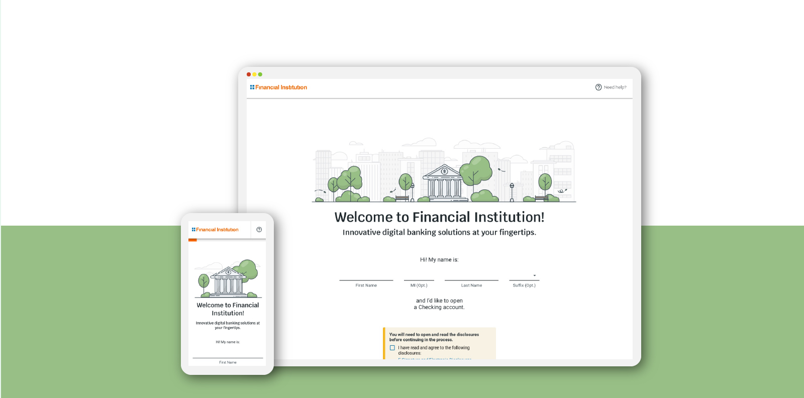
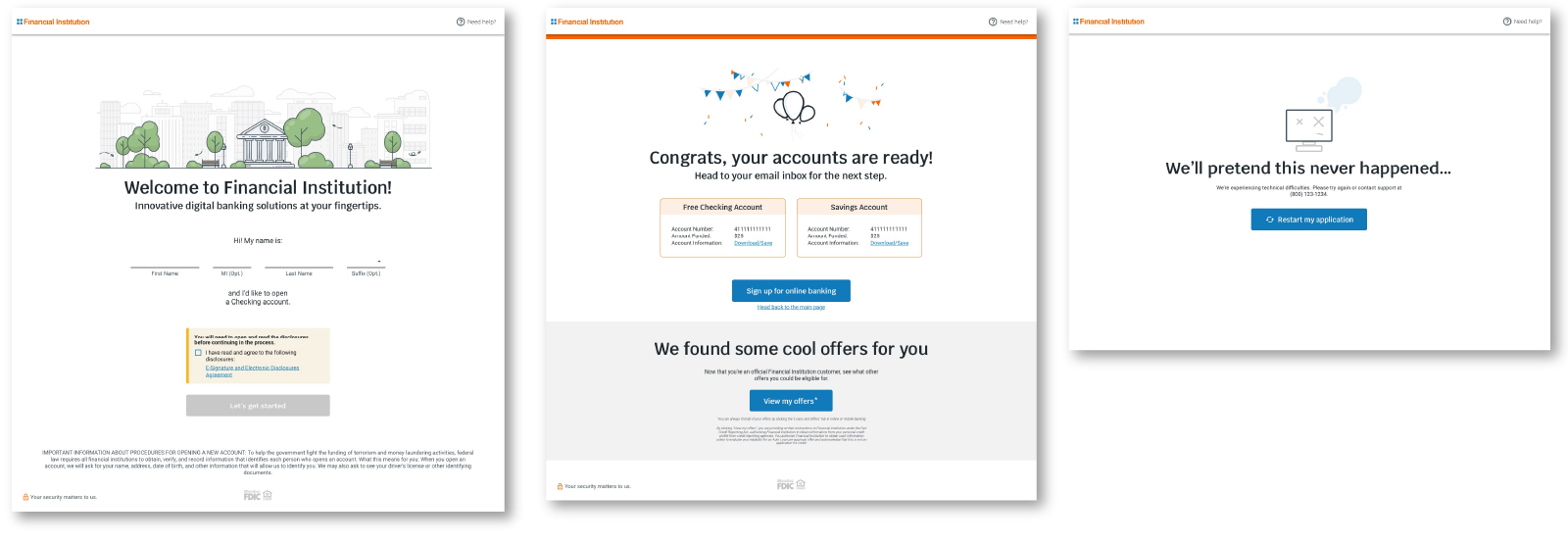
Fiserv’s account opening product is a software as a service (SASS) white label product that Financial Institutions (FI) can use for their own customer accounts. It includes Personal Identification Information (PII) gathering, Social Security Number (SSN) verification, and deposit capabilities. While work is still ongoing to add new features, the core design was created by me and a team of two other designers who worked on wireframes, research, and high-fidelity designs that were handed off to product and development teams. Over the two years I was on this project team, I led the design efforts as a team lead and had many meetings with managers, developers, and sales units to make sure we were constantly aligned on our design vision and that we were delivering a cohesive experience to our users. A sample of a bank branded version can be found here under “Open Account”.
- Role: UX/UI Designer and Team Lead
- Timeframe: Time Frame: June 2019 – March 2021
Research
While initially researching for this project, we looked at flows like TurboTax, Citi Bank, Simple Bank, and Oxygen. While researching and talking with our CEO, we decided that our flow needed the following items:
- • Conversational flow: Many other account opening softwares relied on long form flows that users had to scroll to fill out. We wanted to set ourselves apart on the market by creating a conversational, friendly flow that guided the users through the process.
- • Clean, modern UI: Another way to set ourselves apart from other account opening flows was to update the UI to be more modern, which we were hoping would also translate to more trust in the system.
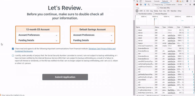
- • A simplified process: A lot of account opening processes rely heavily on data entry, often asking for the same thing 2 or 3 times; we wanted to streamline that where possible and tried to automate so the user wouldn’t even have to input information at all.
Wireframes
Our wireframes consisted of combining the information we needed from the user in different ways to try and get the quickest and simplest user flow we could; we were aiming for under 2 minutes, from start to finish. Many of the wireframes were whiteboard sketches with our team, who had the breadth and depth of knowledge about the banking industry that the design team needed to create user friendly flows.
At the beginning of the process, to get the project off the ground and running, we did an intensive 1-week session with all our product people, including our CEO, development leads, and project managers where we outlined the whole flow and decided what we could add and take away from traditional account opening processes.
User Testing
After getting a good idea of where the project was going and what we needed to test, we did very quick prototypes and tests with different banks that were using some of our other software at the time. These were on-site and in-person, and the test participants ranged from accounting departments to salespeople at the banks. We were able to quickly iterate ideas and sometimes test twice in a day, and I can say with confidence that it’s my preferred way to conduct user studies!
UI High Fidelity
After doing initial research with our users, we moved onto high-fidelity designs and prototyping. We focused on making sure we had all the interaction states represented in our design system, as well as designs for desktop, mobile, and tablet.
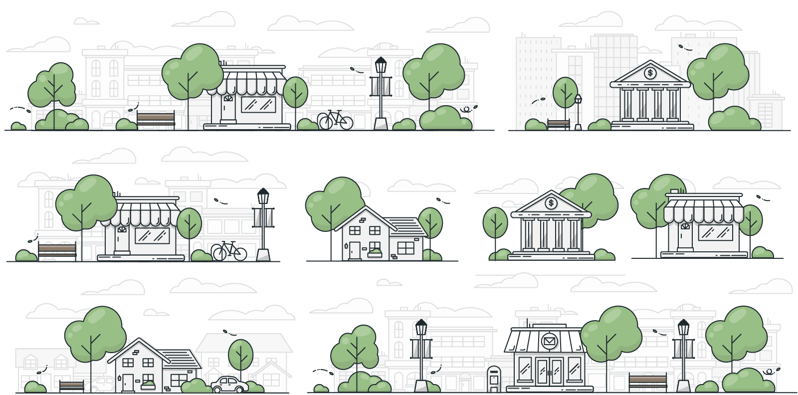
Another aspect of the high-fidelity designs that I specifically got to focus on was our illustration language! This was really fun and let me set up a strong base for our illustration library going forward. I’ve been able to take those initial illustrations and am now in the process of creating an interchangeable library/design system specifically for our illustrations, where any designer can go in grab a few items, and come up with their own illustration that still fits our products look and feel without needing to take the time to make their own illustration from scratch.
The project is ongoing today and continues to iterate, test, and improve upon what we have already built.